Welcome to fish website!
NEW THINGS TO CHECK OUT:
- New header image placeholder!
- Video Game Blog updated Weekly!
- Added a secret shhhhhhh ;)
- RSS code for the blog!
- Light and Dark mode depending on computer settings! Tell me if it works!
- Message Board, leave me a message!
- Updated site to fit these accessability guidelines. Let me know if they don't work!
Last Updated:
You are Visitor #:
Planned updates:
- fix all the blinkies they are not the same size and look ehh
- make the header a different image and not a link to another website
- page hosting all my fanworks
- WIP: linktree page to other socials
- In my brain this is a series of images that are buttons but I am bad at CSS
- video game blog insert on main page
- Figure out the code for the scroll so I can have a couple of messages instead of 1
- General Formatting
LOOK AT THIS DOPE VIDEO
Test Insert:
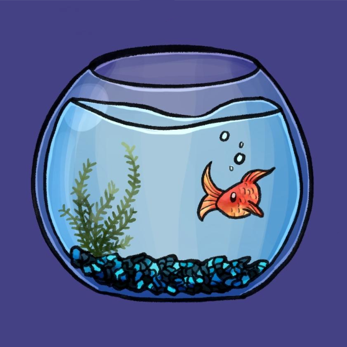
Fish Image. I refuse to make it smaller


